Activity
Mon
Wed
Fri
Sun
Aug
Sep
Oct
Nov
Dec
Jan
Feb
Mar
Apr
May
Jun
What is this?
Less
More
Memberships
AI Website School
646 members • $29/month
AI Automation Society
415.1k members • Free
BuilderzGym
373 members • Free
Simon Says AI
3.6k members • Free
Klient Engine
1.8k members • $9/month
AI Automation (A-Z)
161.4k members • Free
BraveBrand
478 members • $14/month
Tech Snack | Vibe Coding & AI
19.4k members • Free
AI Mate Lite
1.7k members • Free
3 contributions to Logiaweb

Mar '25 •
🚨 New YouTube Video is Live!
Let me know in the comments of the YouTube video which type of content you’d like to see next, and I’ll make it happen!

1 like • Mar '25
Great resources!

Mar '25 •
Fashion Brand Website Design
Would love to receive feedbacks! Figma 🔗: https://www.figma.com/proto/R07j6imgFjF05JvXOpIgmJ/PROJECT?page-id=0%3A1&node-id=336-21&viewport=-4334%2C-102%2C0.26&t=0vAM1oYYSPtZ5aG2-1&scaling=min-zoom&content-scaling=fixed&starting-point-node-id=197%3A2
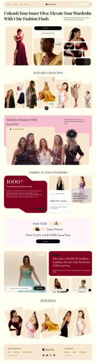
2 likes • Mar '25
1. Title and secondary text are ok, but its too much to read and feels overwhelming. 2. First section is ok, but not sure where to click, or what's clickable. 3. Featured collection, is that a padlock or a shopping icon? 4. First red text block repeats the content within? 5. Is there one blog or multiple blogs? 6. Should it say 4 min vs 4 mint for reading time? 7. Our feed, is that interactive? does it only show 5 items?
Mar '25 •
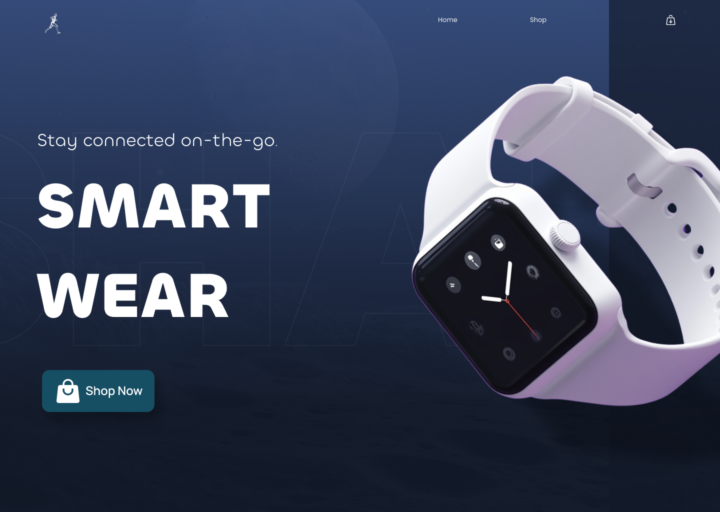
Rate My Web Design! Open to All Suggestions!
Hey everyone! 👋 I just designed this new hero section for a [smartwatch/e-commerce/tech] website, and I’d love to get your thoughts on it. My main focus was on clean typography, a modern layout, and engaging visuals. 🔥 What I’d love feedback on: - Overall design & visual appeal - Readability & usability - Any improvements you’d suggest All feedback is welcome! Thanks in advance. 🙌
0 likes • Mar '25
1. The logo doesnt appear to be a logo, I could image users not knowing its a link either. 2. Why is there just a single Shop link? is there any more to the concept? 3. The shopping icons are different 4. The hero button doesn't need a shop icon, it should be worded in a way to entice the user to click it, plus its low contrast 5. The typography is way too spaced for the title 6. "Stay connected..." preheader doesn't sell it well, it should ideally be a unique feature that grabs the users attention, as its essentially competing against all the top brands out there e.g Apple, Garmin to name a few, and is the first thing a user will see.
1-3 of 3

Active 4h ago
Joined Feb 15, 2025
Powered by