Activity
Mon
Wed
Fri
Sun
Mar
Apr
May
Jun
Jul
Aug
Sep
Oct
Nov
Dec
Jan
Feb
What is this?
Less
More
Memberships
Typographic North
95 members • Free
19 contributions to Typographic North
Block quotations
Block quotations should be clearly separated from the surrounding text. I admit I keep doing many just out of habit. The way I set block quotations in longer texts is one of those things I haven’t really thought much about since I learned how to do them. And I primarily do them this way: - When a quote in the text spans three lines or more in a paragraph, I extract it and set it as a block quotation. - I set the size 1 point smaller than the body text (so, a 10-point quotation after an 11-point paragraph). - I use the same leading as the paragraph text. - I indent 1 em on both the left and the right side (usually I indent every paragraph 1 em as well). - I add a white line before and after the quotation. - I keep quotation marks in the quote. Sometimes, variants sneak in. In more commercial folders and marketing material, I can experiment wildly. But in books, these are the rules I seem to stick by. How do you set your block quotes?

The storytelling superpower of typography
Hi, today I'm sharing this article by Louise Sloper from Shots Magazine. https://magazine.shots.net/news/view/the-storytelling-superpower-of-typography 'Typography is an art form and a science, ' Sloper writes. This is my stance as well, and a reason I'm so attracted to it. It's both creative and productive, both open and closed. There are rules, but also endless possibilities. She shares this anecdote: 'Back in 2013, acclaimed filmmaker Errol Morris ran an experiment in the New York Times. Readers were encouraged to consider a passage from The Beginning of Infinity by David Deutsch, discussing the likelihood of Earth being destroyed by an asteroid. The catch was that the online article was secretly set in varied, randomised typefaces, and followed by a survey asking whether the viewer agreed with Deutsch’s statement and, consequently, if they saw themselves as an optimist or a pessimist. What Morris discovered was that Baskerville was statistically more likely to influence the minds of the participants than Georgia, Helvetica, Comic Sans or Trebuchet. It was a small but interesting experiment illustrating how typography can shape our perception of the truth.' Now, that is illustrative of the power that lies in typography!
Helvetica or Times?
You're facing a terrible choice. The world is devoid of typefaces, fonts have been dissolved into faint memories. Those glorious font selection menus cut down to a binary. Written communication persists, though; even though the selection is slim, you have options: Times New Roman or Helvetica. For all time. Which font will you use in all applications, forever? Why?
Poll
7 members have voted

2 likes • May '25
@Olabinjo Oyinkansola When Times is used on stone (I look at it as a letter cutter) I don't feel its soul. I sometimes see it used for lack of effort to go for something more specific and less generic. In that case its 'classicism' feels like laziness, rather than 'timeless' or 'historic'. Of course I shouldn't only cite the bad use of it and think of the best examples. Anecdote: an architect once asked me to use Times NR for the lettering on a building. I designed something else, he didn't see it. I guess for him TNR just meant a Roman Cap.
Script: the personal touch
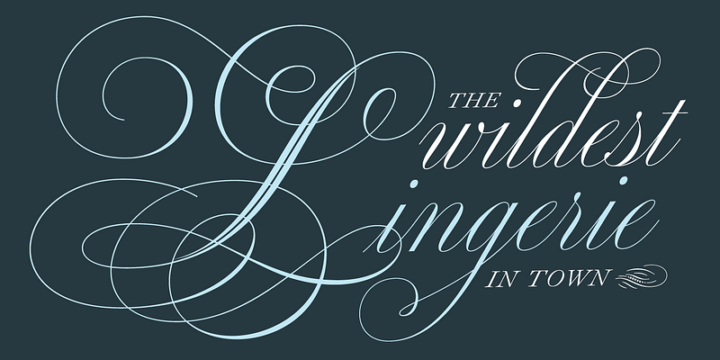
Here lives the ghost of handwriting – from formal copperplate engravings to casual café chalkboards. Script typefaces preserve humanity's most intimate form of communication. Some echo the disciplined strokes of 18th-century writing masters. Others capture the spontaneous flow of brush and pen. All carry the warmth of human gesture. They often retain the joining strokes from formal handwriting, the cursive. Some designs feature a distinct contrast between thick and thin strokes, mimicking the appearance of broad pens and brushes. Others trend towards decorative styles seen on signs and posters. They’re heavily influenced by time periods and culture. It’s a bit of a paradox how these handwriting styles have migrated over into computer pixels. But I’m glad they’re there, because I can’t write like this. Do you use script faces in your work? I know some of you here actually work with your hands to achieve these letterforms. And I'm impressed!

Serifs vs sans-serifs
Before we dive into the complex and varied forms of classifying typefaces, let's start with this: we have two major categories – those with small bits at the end of the strokes, and those without. Those tiny end strokes are, in general, called serifs. And the two categories, then, are distinguished by having serifs or not. They are called serif typefaces or sans-serif typefaces. Where do we place lettering that looks like handwriting? Or blackletters found in those old bibles? And aren’t there tons of different serifs and sans-serifs? Yes, there’s a lot to explore here. Let’s take one step at a time and explore the grotesque world of type classification.

2 likes • May '25
Again from the side line - as letter cutter. For us - who draw all our letters by hand - serifs not only define the mood of our design, they really can help to achieve a better sense of rhythm. Depending on the kind of stone we can get by, and the size of the letters, the wide range of possible serifs is severely restricted - if we chose for lettering that is real stone lettering and not an imitation of type on stone (which can be perfectly done though on fine-grained stone by a decent craftsman). For designers who use type the situation must be quite different. what are the obstacles for you?
1-10 of 19
@kristoffel-boudens-5440
1958. Art school / painting. Letter cutter since 1989. My father was a calligrapher and I have 1 brother and 2 sisters into letters.
Active 113d ago
Joined Jan 31, 2024
Bruges / Belgium
Powered by


