Activity
Mon
Wed
Fri
Sun
Jul
Aug
Sep
Oct
Nov
Dec
Jan
Feb
Mar
Apr
May
Jun
What is this?
Less
More
Owned by Kate
Learn how to plan and design your build or renovation with clarity—using simple, expert-led info sheets for the best outcome, without the overwhelm.
Memberships
Pro Gig Academy
4.8k members • Free
AIpreneurs (Free)
10.5k members • Free
47 contributions to Interior Design Skool

May 18 •
Welcome new members!
We are officially 250 member strong! Comment your current reno/build question for your chance to get a free 1:1 call with me!
0 likes • May 22
@Alison D how exciting! Is it a whole home?
0 likes • May 23
Please share! I’d love to see them! I can give you info if that helps x
May 14 •
Project Images
I have received some project images from a newly completed project and we're all very happy with the result. What do you think? Would you be this brave? Vote below.
Poll
4 members have voted
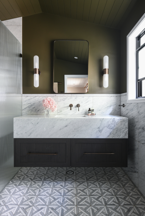
0 likes • May 19
@Michelle Feik paste the tile you would have used x

Apr 8 •
Kitchen HELP!
We are doing a refresh on the house. The fixed elements are the floors, wall colour (don't love it but its already been painted) and the terrazzo style looking stone. How can i bring this altogether? We are painting the kitchen cabinets and have no idea what colour? How do i bring it all together as the benchtop is quote a cool tone.
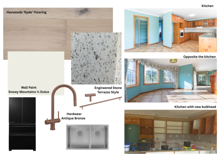
0 likes • Apr 15
I love this palette and think it’s a really nice way to warm up the grey stone. Well done 👍🏼
0 likes • May 11
@Bronwyn Gray I think this is from Chat gpt by the looks of it X

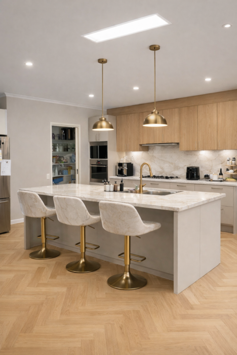
Mar 26 •
Flooring and kitchen cabinets
Hi everyone how do you pick a timber (polytec) that will go with your flooring? We are doing a renno of the kitchen and flooring. I am thinking of doing upper cabinets in Boston oak with stone ambassador tops in Perla venata. Lower cabinets in griege (polytec) and our floors are herringbone naturals collection in forest. Will this tie together do you think? I don’t have the time to go looking at samples every weekend so I am doing all this online ! Photo is a ChatGPT of what we are after with this layout. Walk in pantry is yet to be designed properly and it’s not overly large. I don’t know why the stools are in the bench colour lol but the island will be much bigger and the right hand side cupboards will go down to the bench to make a coffee/breakfast bar so not sure if I should go the lighter colour not the wood to match the side with the ovens? Thoughts? We also have black doors and sliding inside aluminium black doors so a lot of black and darker colours already.will probably have black stools. Second and third photo is original kitchen which works really well so keeping a similar layout
0 likes • Apr 1
Yes please! I'll wait to hear from you X
1 like • May 11
Hi Bronwyn, probably best to send me an email - [email protected]

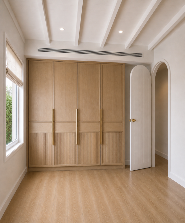
May 4 •
Bedroom design
Hi all, I’m after some advice. We are working on the first room in our whole home renovation. I’m struggling with deciding what colour to go with for our joinery. I can’t decide between a light oak or walnut colour…what I decide will be used through the rest of the renovation so I really want to get it right. We live near the water and the renovation style will be somewhat of a Mediterranean beach house but I want it to have character and not just be the same white Beachhouse that is everywhere now. The floors will be wide plank light oak in colour and already purchased so can’t change. I’ve added some AI images I created to show the room layout and the 2 colour ideas. Note: this is my son’s room but joinery will be similar throughout each room.
0 likes • May 6
For this I personally prefer to keep the joinery more matching with the floor. What is the colour of the flooring you have already chosen?
1 like • May 6
@Kristy Nowak sounds fab. Call laminex and polytec and get some samples so you can compare the two colours and make sure the tones match
1-10 of 47

Active 1h ago
Joined Nov 10, 2025
Sydney, Australia
Powered by