Activity
Mon
Wed
Fri
Sun
Aug
Sep
Oct
Nov
Dec
Jan
Feb
Mar
Apr
May
Jun
What is this?
Less
More
Memberships
Melissa AF Harmon Creative
102 members • Free
Ai Filmmaking
6.8k members • $7/month
E365 Academy
3.1k members • $7/m
3 contributions to Melissa AF Harmon Creative

Mar 29 •
Quick update
Hey everyone. Been quiet the last few days again. I'm sitting at Children's Hospital with my daughter. She's got some medical issues going on at the moment (we've been in the hospital since Thursday). All will be okay, but she'll be having surgery later this week. I *might* need to delay the planned Focus and Flow event for the 8th, depending on timing. I will update as soon as I know for sure. In the meantime: Are you having success with a specific tool? What's your favorite and how does it fit into your workflow?

0 likes • Mar 29
You have my prayers and my well wishes for her
Jan 31 •
I Gave 6 AI Tools the Same Brutal Prompt. Only 2 Survived.
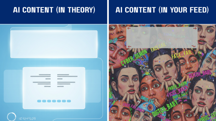
I'll be honest: I set these AI image generators up to fail. The prompt was a beast—a split-screen "Expectation vs Reality" meme with specific text placement, a centered overlay, AND a footer. Think of it like asking someone to juggle while riding a unicycle... backwards. Why the torture test? Because most people expect AI to nail complex requests in one shot. This experiment shows what really happens when you dump everything into a single prompt. Remember: each model has strengths and weaknesses. These results only reflect how they handled THIS style of prompt—your mileage will vary. THE CHALLENGE Here's what I asked every AI to create: Left Panel (Expectation): Clean futuristic UI, calm colors, labeled "AI CONTENT (IN THEORY)" with tidy text blocks and balanced composition. Right Panel (Reality):Absolute chaos—overlapping text, crooked faces, random fonts, labeled "AI CONTENT (IN YOUR FEED)". The Kicker: Big centered overlay text reading "THIS AIN'T IT" spanning both panels, plus a footer: "Learn to do AI right → The Prompt Lab" Think of this as the Final Boss level of AI prompting. Four distinct text areas, precise layout control, and stylistic requirements all at once. THE RESULTS: Who Survived? 🏆 GEMINI – Near Perfect Structure What Worked: Gemini crushed the structural requirements. It nailed the "THIS AIN'T IT" overlay in a stylistically perfect 8-bit font and actually included the footer text—something most tools completely ignored. What Missed: The "Reality" side showed cats instead of the requested "crooked faces and visual nonsense." Funny? Yes. But a bit too safe. Pro Tip: Gemini loves structural hierarchy. Use clear "Left Panel / Right Panel" logic in your prompts. 🥈 DALL-E 3 (ChatGPT) – Text Rendering Champion What Worked: DALL-E 3 is currently the king of readable text in images. The "Reality" side delivered genuine chaos with overlapping elements, and the footer appeared correctly. What Missed: It got confused and duplicated "THIS AIN'T IT"—putting it at both the top AND bottom instead of centered. The "Theory" side also went too Sci-Fi when I wanted clean UI minimalism.
1 like • Feb 1
I used several AI system’s with help from ChatGPT to create my animated true story about the night I met and hung out with Muhammad Ali. I have to say that ChatGPT did excellent in taking information from my prompt’s which in turn my images and animation are done, all I need to do now is put the story together and a voice over with either my voice or one from Hume or elevenLabs.
Jan 28 •
Why your AI "hallucinates" (and how to fix it) 🍞
Ever feel like the AI is just making stuff up? It’s not trying to lie to you—it’s just a world-class pattern-finder following the "breadcrumbs" you left. If the crumbs are too far apart, the AI fills in the gaps with its best guess. In the Lab, we think of a prompt as a trail. If you want the AI to reach a specific destination, you have to place the crumbs closer together. 3 Quick Tips for a Clearer Trail: 1. Skip the Subtext: AI doesn't "get" hints. If you want a friendly tone, tell it: "Use a warm, conversational tone." 2. Define the Scope: Instead of "Tell me about marketing," try "Give me 3 beginner strategies for digital marketing." 3. The Goal Check: Always include a verb. Use "Summarize," "Rewrite," or "Brainstorm" so the AI knows exactly what action to take. What’s one task you’ve been "vague" with lately? Let’s try to tighten that breadcrumb trail together!
1 like • Feb 1
Thank you for that very valuable information
1-3 of 3

@jae-gregory-9638
Radio Announcer for well over 30 years discovering Art concepts with Ai now going on about a year and a half and loving every moment of it.
Active 21d ago
Joined Feb 1, 2026