Activity
Mon
Wed
Fri
Sun
Oct
Nov
Dec
Jan
Feb
Mar
Apr
May
Jun
Jul
Aug
Sep
What is this?
Less
More
GTC
240 members • Free
68 contributions to GTC

Jun 10 •
WRITING TASK 1: Bar chart
The bar chart below shows the percentages of three groups of Japanese children taking part in four kinds of activities in 2018. Summarize the information by selecting and reporting the main features, and make comparisons where relevant. Write at least 150 words. 𓂃🖊 The provided information illustrates the percentages of Japanese children in three age groups who participated in four different leisure activities in 2018. Overall, participation in reading and bicycle riding generally increased with age, whereas computer gaming became less common among older children. Additionally, watching TV was the most popular activity. Regarding reading, approximately 64% of children aged 5–8 read books, and this figure rose to around 71% among both the 9–11 and 12–16 age groups. A broadly similar trend was observed for bicycle riding. About 65% of the youngest children rode bicycles, compared with 63% of those aged 9–11. The proportion then increased significantly to just over 80% among teenagers aged 12–16, making it the most popular activity in this age category. Among children aged 5–8, 93% watched television, whereas the figure dropped considerably to approximately 80% in both older groups. In terms of computer gaming, around 60% of the youngest children participated in this activity, before the percentage declined slightly to 57% among 9–11-year-olds and then fell more sharply to only 40% among those aged 12–16, which was the lowest figure recorded for any activity in this age group. ﹌﹌﹌﹌﹌﹌﹌﹌﹌﹌﹌﹌﹌﹌﹌﹌﹌﹌﹌﹌﹌﹌﹌﹌﹌﹌﹌﹌﹌﹌﹌﹌﹌﹌﹌﹌﹌﹌﹌﹌ Why this grouping works well This is a very standard and high-scoring structure: ✔ Logical grouping by trend - Group 1: increasing activities - Group 2: decreasing activities - This is preferred because: - It avoids mixing unrelated trends - It makes comparisons easier for the reader - It shows clear data organization skill (important for Task Achievement) ﹌﹌﹌﹌﹌﹌﹌﹌﹌﹌﹌﹌﹌﹌﹌﹌﹌﹌﹌﹌﹌﹌﹌﹌﹌﹌﹌﹌﹌﹌﹌﹌﹌﹌﹌﹌﹌﹌﹌﹌ Useful expressions: - Regarding… - approximately / around - this figure rose to… - a broadly similar trend was observed - compared with… - the proportion then increased significantly to… - making it the most popular activity in this age category

2 likes • Jun 11
@Lynn Chen Regarding “proportion”, it is not limited to pie charts only. It can be used for any chart that presents parts of a whole, including bar charts, as long as the figures are shown as percentages. For example, “the proportion of children who watched TV” is acceptable because it refers to the percentage/share of children in that group. However, “percentage” or “the percentage of” may sound more straightforward for bar charts, especially in IELTS Task 1. “Proportion” is simply a more academic alternative and is commonly used in IELTS responses. So both are possible; the important thing is that the word matches the data being described.
2 likes • Jun 11
@Lynn Chen Thank you for your comment. Your observation is actually correct — if we are comparing activities among older children, reading and computer gaming may be less common than watching TV, depending on the data shown. I already removed it
Mar 14 •
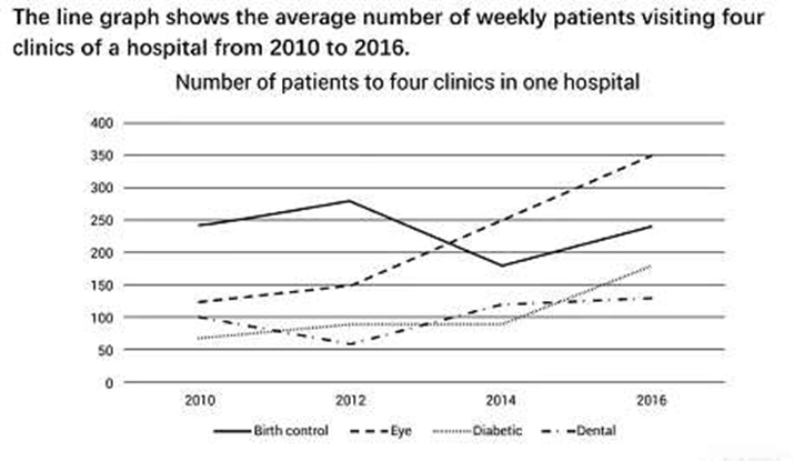
Writing Task 1 - LINE GRAPH 📈
The supplied information compares the average weekly number of patients visiting four clinics at a hospital between 2010 and 2016. Overall, patient numbers increased in most clinics, except for the birth control clinic. Consultations for eye problems overtook those for birth control, becoming the most frequent, while diabetes and dental visits remained the least common. In detail, birth control visits started higher at roughly 250 in 2010, compared with 125 for eye consultations. Although birth control visits rose to 275 in 2012, they then fell sharply to 175 in 2014, whereas eye consultations increased slightly in the first two years before surging to 350 in 2016. By the end of the period, eye consultations had clearly surpassed birth control, highlighting a contrasting trend between the two categories. Diabetes appointments began at 60 and rose steadily to 175 by 2016. Dental visits, which started higher at 100, fell sharply to 50 in 2012. Although dental visits recovered moderately to 125, diabetes appointments maintained a stronger upward trend, eventually surpassing dental visits. 170 words ✅ Trend / Change Word List ➡ increased ➡ rose steadily ➡ surging ➡ dropped sharply ➡ fell sharply ➡ recovered moderately ➡ maintained a stronger upward trend ➡ eventually surpassing ✅ Comparison / Contrast Word List ➡ overtook ➡ becoming the most frequent ➡ remained the least common ➡ compared with ➡ whereas ➡ while ➡ demonstrating contrasting trends ✅ Linking / Cohesion Phrases ➡ overall ➡ in detail ➡ although / while / whereas ➡ by comparison ➡ compared with ✅ Describing Data / Numbers ➡ were higher at around… ➡ initially / began at / started higher at ➡ during the first two years ➡ slightly ➡ moderately ➡ clearly surpassed ✅ Medical / Context Word List ➡ appointments ➡ consultations ➡ eye-related visits Now, it is your turn to write a report for this task using these vocabulary items. ✍📃✨
0 likes • Jun 10
@Alex Sui Yes. In that sentence, “the two categories” clearly refers to birth control visits and eye consultations, which are the two categories being compared throughout the paragraph.
May 3 •
Writing Task 1: LINE CHART
The graph below shows information about male and female gym membership between 1980 and 2010. 👇👇👇 The line graph compares the number of gym members by gender over a 30-year period, from 1980. Overall, the number of male participants fluctuated significantly, with two noticeable peaks, while female participation showed a steady upward trend. In detail, in 1980, there were approximately 2,000 male members, which was twice as many as female participants. The figure increased to over 4,000 in 1985 before dropping to below 2,000 by 1995. In contrast, the number of women rose steadily from just over 1,000 in 1980, surpassing that of men after 1990 and reaching a peak of 3,000 in 1995. By 2000, male participation rose sharply again and overtook the female figure, reaching a peak of 5,000 in 2005. Meanwhile, the number of women declined slightly in 2000 and subsequently rose to 3,000 in 2005. However, by 2010, both figures fell, with the number of men dropping dramatically to under 1,000, while the female figure remained higher at around 1,900. ════════════════════════════════════════════════════════ 📈 Highlighting key features - with two noticeable peaks - reaching a peak of - surpassing that of - overtook the figure - twice as many as 📍 Time expressions - over a 30-year period from 1980 - by 2000 / by 2010 - before + verb-ing (e.g., before dropping) - after 1990 - meanwhile - subsequently 🧩 Useful sentence structures - The number of X + verb… - There were approximately… - X was twice as many as Y - X surpassed / overtook Y - X rose from A to B Try writing it on your own and incorporate the useful vocabulary and expressions provided. 😎👌🔥

0 likes • Jun 10
1. No. The correct form is “a 30-year period."❌ 30 year period❌ 30 years period✅ 30-year period “30-year” is used as an adjective to describe “period.” When a number + noun comes before another noun, the noun stays singular and is usually hyphenated. Examples: - a 5-year plan - a 10-day trip - a 30-year period So: ✅ a 30-year period❌ a 30 years period (the noun “year” should be singular)❌ a 30 year period (missing the hyphen) Think of “30-year” as one adjective modifying “period.” 1. Yes. You can write “from 1980 to 2010.” It’s clearer than “from 1980” because readers don’t need to calculate the end year. ✅ from 1980 to 2010✅ between 1980 and 2010⚠️ from 1980 (correct, but less specific)
May 31 •
Writing Task 1: PROCESS
You should spend about 20 minutes on this task. The illustrations show how chocolate is produced. Summarise the information by selecting and reporting the main features and make comparisons where relevant. Write at least 150 words. ᝰ✍🏻 .ᐟ The diagram provides information about the process of making chocolate. Overall, there are ten stages in the production process, commencing with the cultivation of cacao trees and culminating in the manufacture of chocolate. Initially, cacao trees are grown in regions such as South America, Africa, and Indonesia. Once the pods have ripened and turned red in colour, they are harvested, after which the white cocoa beans are extracted from inside them. Following this, the beans undergo a fermentation process before being spread out on large trays and left to dry naturally under sunlight for a certain period of time. Subsequently, the dried beans are packed into large sacks and transported by train or lorry to the factory, where they are roasted at a temperature of 350 degrees. Once roasted, the beans are crushed in order to remove their outer shells. In the final stage, the remaining inner part is pressed, resulting in the production of chocolate ready for consumption or further processing. ✎﹏﹏﹏﹏﹏﹏﹏﹏﹏﹏﹏﹏﹏﹏﹏﹏﹏﹏﹏﹏﹏﹏﹏﹏﹏﹏﹏﹏﹏﹏﹏﹏﹏﹏﹏﹏ Grouping: 1️⃣ Growing and Collecting Cacao Beans This group includes: - growing cacao trees - ripening pods - harvesting - extracting beans Good expressions - “The process begins with…” - “Initially…” - “In the first stage…” - “Once the pods have ripened…” - “the beans are extracted from…” - “after being harvested…” Example: Initially, cacao trees are cultivated in tropical regions, and once the pods have ripened, the beans are extracted after harvesting. 2️⃣ Preparing the Beans This group includes: - fermentation - drying Good expressions - “The beans then undergo…” - “Following this…” - “The next stage involves…” - “before being left to dry…” - “spread out on trays” - “dried naturally under sunlight”
10
0

May 24 •
Writing Task 1: MAP
You should spend about 20 minutes on this task. The map below shows the development of the village of Ryemouth between 1995 and present. Summarise the information by selecting and reporting the main features and make comparisons where relevant. Write at least 150 words. ᝰ✍🏻 .ᐟ The maps illustrate the transformation of the village of Ryemouth over the last twenty-five years. Overall, the village has changed considerably, with new housing and recreational facilities being developed, while the fishing industry has disappeared entirely. In detail, in 1995, most of the residential area was concentrated in the northwest along the main road, where twelve houses were located, including four situated on a smaller side street. Meanwhile, the northeast of the village was occupied by farmland and a forest park. Along the southern coastline, there was a fishing port accompanied by a large fish market, and a small café stood nearby. On the opposite side of the coastal road, there were also five shops and a hotel. Today, although the original houses are still present, several new homes have been added together with an extra road. In the northeast, the former farmland has been turned into a golf course, while the forest park has given way to tennis courts. The most dramatic change, however, can be seen along the coast, where the fishing port and fish market have been replaced by four apartment buildings. In addition, the shops have been converted into restaurants, whereas the café and hotel remain, with the latter now featuring a car park. ════════════════════════════════════════════════════════ Discussion of the Grouping The report is grouped mainly by location/area, which is one of the best ways to organize an IELTS Academic Task 1 map description. ✔️ Introduction: “The maps illustrate the transformation of the village of Ryemouth over the last twenty-five years.” This is concise and accurate. ✔️ Overview: “the village has changed considerably, with new housing and recreational facilities being developed, while the fishing industry has disappeared entirely.”

4 likes • May 24
A general tip for IELTS Task 1 maps is: Focus on the “big picture” first before the small details. In your overview, identify the main changes, such as: - urbanization, - modernization, - increased transportation, - more green spaces, - or expansion of facilities. Examiners care a lot about whether you can clearly summarize the major trends, not just list every change on the map. Another helpful habit is to: - spend 2–3 minutes analyzing the map before writing, - notice what disappeared, what was added, and what stayed the same, - then group related details together in your body paragraphs. A clear structure and logical organization can improve your score more than using very advanced vocabulary.
2 likes • May 28
@Alex Sui Yes, it is acceptable in IELTS Writing Task 1. Although the period from 1995 to 2026 is actually close to 30 years, IELTS map questions usually use the term “present” in a general sense. Candidates are therefore not required to work out the exact number of years. As a result, the phrase “over the last twenty-five years” sounds natural and would not be considered incorrect. Nevertheless, if you prefer to be more precise, you could use alternatives such as: - “over the last thirty years” - “over the past three decades” - “between 1995 and the present day” All of these expressions are also suitable for a high-scoring response.
1-10 of 68

@g-admin-9427
In our class, English is something to explore & use every day. I'm excited to help you grow in confidence while having fun learning English together!
Active 60d ago
Joined Nov 14, 2025
Powered by