Activity
Mon
Wed
Fri
Sun
Feb
Mar
Apr
May
Jun
Jul
Aug
Sep
Oct
Nov
Dec
Jan
What is this?
Less
More
Memberships
Embroidery Legacy Software Hub
1.7k members • Free
Typographic North
91 members • Free
2 contributions to Typographic North

🔥
Aug '25 •
Balancing the hemispheres
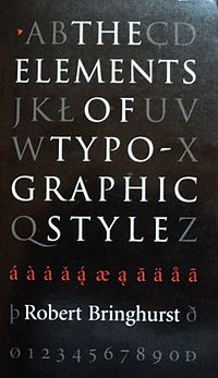
In 2002, I was transitioning from working with newspaper layouts to designing my first book. To help me along, I ordered a book that changed my trajectory forever. It was eye-opening. That book truly cemented my interest in typography and design. The book was The Elements of Typographic Style by Robert Bringhurst. The world of typography opened up to me. I was introduced to rules I had never learned before and, at the same time, inspired to break some of them or at least be creative with type in ways I didn’t realise were "allowed." This duality captivates me. On the one hand, there are good reasons why we rely on written conventions. They work, people are used to seeing them, and if we deviate too much from standards established over centuries, things can get quite ugly. On the other hand, there are vast possibilities to experiment and have fun with letterforms and type. You can push the envelope and create something interesting while still maintaining readability. These two aspects combined have kept my interest in typography burning for so many years. I like rules, but I also like to bend them. I like clear instructions, but also a blank canvas. I enjoy this balancing act in my creative business as well. Some days it's good to step into the role of an artist—to sketch, draw, and experiment. To make design decisions, create templates, choose colours, and find solutions. And then, the next day, to put on headphones, drink a cup of coffee and just build within the creative boundaries I've established earlier. I appreciate both aspects of the process, and I value that I can embrace both without having to choose. I'm not purely a design studio or a production house—I'm somewhere in between, balancing these complementary approaches. Typography offers tools for both hemispheres of the brain. It attracts both the disciplinarian and the rule-breaker, the perfectionist and the carefree spirit. Where do you sit on this scale?

2 likes • Aug '25
Form and function go hand in hand. What is the function, idea, purpose, you’re trying to present? Then using that, how will you form your text to help guide that idea? Whether it be through a simple paragraph even invites the question of its shape and layout itself. Chose from the Fonts to give it impact and from there, define its shape yet again. Just as an illustration, your typography can help present the entire idea, compliment the presentation, yet be subtle enough to catch and hold attention without a jarring, off putting reaction. This is the delicate dance of form and function of fonts as an integral part of design. Yes, even Comic Sans can be used successfully as proven by the business I built and ran for 20 years…
0 likes • Aug '25
@Kris Hus I’ve modified the XtraHandz to make it more pleasing by placing the centerline of the Caps with the top of the lowercase, I may have adjusted the kerning at the time too. Fonts themselves can’t be treated as static entities - This van was my only advertising besides word of mouth and I received an average of 4 calls a week while driving or parked outside of a clients home.
🔥
Apr '24 •
Oversized typewriter ball head
I stumbled upon this typewriter ball art this weekend. I haven’t actually seen one of these in real life, but it’s an interesting technology. Nice to see the type and various impressions around it. Have anyone here used a typewriter with this kind of ball head?

2 likes • Jul '25
We had several of the IMB Selectrics in the Plant through the '70's. Yes, fascinating machines.
0 likes • Jul '25
Wish I would have thought to keep a few of those Font balls in hindsight!
1-2 of 2
Active 7m ago
Joined Jul 1, 2025
Powered by