Activity
Mon
Wed
Fri
Sun
Jul
Aug
Sep
Oct
Nov
Dec
Jan
Feb
Mar
Apr
May
Jun
What is this?
Less
More
Memberships
🚀 Indie App Accelerator
88 members • $9/month
Co-Creators
7.5k members • Free
Game Makers' Cult
846 members • Free
3D Printerly Profits
301 members • Free
The 3D Printing Hub
971 members • Free
The Designers Society
179 members • Free
Design | Sign-writer Skool
260 members • Free
Six-Figure Graphic Designers
1.3k members • Free
The Digital Marketing Bar
70.1k members • Free
15 contributions to Design | Sign-writer Skool


1 like • May 19
Cool!

1 like • May 5
Super cool!
2 likes • May 3
Tour video when?

Mar 16 •
Lost my 🔥
So Sunday I lost my 🔥 status on Skool. After a lloooonnngg streak. Now I am going to take a little breather before trying to get it back. Shout me any questions!?

1 like • Mar 16
What’s fire status?
Mar 10 •
Today was a sad day.
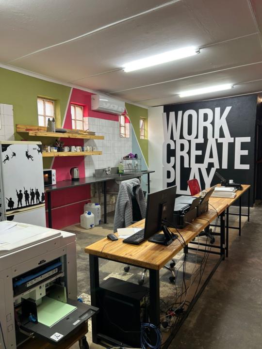
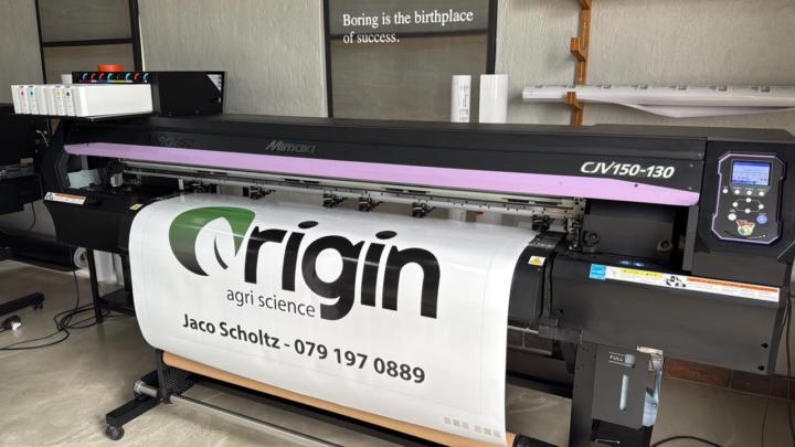
Sometimes in business we make choices. We make them because it feels like the right choice at the time. Then when the choice is happening it feels so wrong that it messes with your mental reality of why you made that choice in the first place. I had to remind myself of all the business sense that it makes to rather sell this printer. I remind myself it was broken, it cost to much to repair, this would be the 3rd print head in 5years, repair cost is a third of a new machine. It all still makes sense. But when it is loaded and paid for at a fraction of the cost that I invested into it. When it seems I did all that work and it feels like it was all a waste…. It hits hard. Choices are never truly right or wrong in business. You just let the outcome come and you deal with it. In this case, it was a loss and tomorrow we get up and we go on. The next hurdle happens, time passes and we have to handle other obstacles. This too shall pass. Ciao Medusa, I hope you serve your new owner well.
1 like • Mar 10
Time for a HP flatbed mmm lol sorry for your loss though
1-10 of 15

@bit-spectre-7792
I am John, aspiring to grow knowledge. Socials are John2dot0
Active 9d ago
Joined Oct 27, 2025