Activity
Mon
Wed
Fri
Sun
May
Jun
Jul
Aug
Sep
Oct
Nov
Dec
Jan
Feb
Mar
Apr
What is this?
Less
More
Owned by N. Colin
For artists looking to create your first comic book or improve your visual storytelling skills
Memberships
Synthesizer Scaling
282 members • $3,400/month
Synthesizer: Free Skool Growth
40k members • Free
Skoolers
194.9k members • Free
Photography Community
3.1k members • Free
Di-Maccio Art Academy
4.8k members • Free
404 contributions to Slinging Ink Skool
30m •
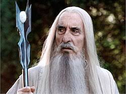
An April of Archetypes: ✨🌟The Magician🌟✨
Time for the next archetype as we go through the 12 most common archetypes is: The Magician. The Magician is right up there with The Hero as one of the most common archetypes that you will find, especially if the story follows the traditional structure of 'The Hero's Journey.' Wherever you have a character who is seen as a prophet, a wizard, a wise man, or maybe even that crazy old kook who talks to himself and lives underneath a bridge. Regardless of the state in which you find 'The Magician', the core of the character remains the same, that they have a decidedly clear power or understanding that is special and beyond that of a normal person in their world. Whether through supernatural ability, physical ability or higher knowledge, the core of all of this is the desire for more of that power. The choice as to whether obtaining that power is a good or bad thing is up to you, and where it gets important to define whether you have a more heroic magician on your hand, or an outright villain. The cool thing about 'The Magician' is that they aren't locked solely into fantasy or actual magic in order to fit into this archetype. It could look more like science or technology or influence (political or otherwise). Many times in a story, it is The Magician who comes along and helps to push our hero into action, helping to be the catalyst to start their journey and begin. Pride, hubris, corruption and disassociation can be some built in pitfalls/weaknesses for this archetype, which is super helpful to know in order to help make a compelling character-based story. Understanding those pitfalls will help to balance out the power, whether its true omnipotence or omniscience and help create some built in conflict to be catered to the character's arc. Some examples of 'The Magician' are: Saurumon (LOTR) Gandalf (LOTR) Morpheus (The Matrix) Anakin Skywalker (Star Wars) Professor Severus Snape (Harry Potter) 'Q' or 'Q-Branch' (Bond Franchise) All desire obtaining more in some shape or form. From political power, power over nature, power over man or the obtaining of wisdom and intelligence beyond that of a normal person. Figuring out how the Magician character acts once they achieve that goal is up to you, and it can have pretty large story ramifications!
0
0
19h •
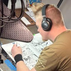
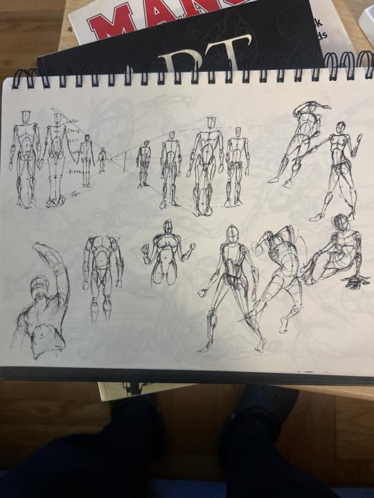
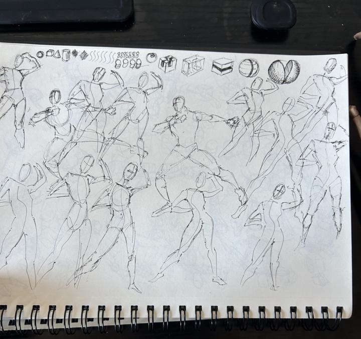
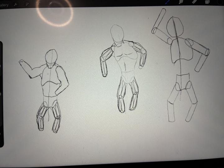
Anatomy and Proportions
These sketches are Mostly from memory and a tutorial. I'm working on using more reference. I'm interested in doing a comic (for practice & fun ) where the characters start out as stick figure skeletons and slowly through the story evolve with “shapes” and “form” eventually into a full-fleshed character by the end what do we think 🤔
0 likes • 7h
@Jose Vanderpool Great work on these studies! Definitely don't be afraid to dive into reference until it becomes second nature in your head. It's also really important to not only practice the muscle breakdowns, but to draw from actual reference and point out mentally where all those muscles are under the skin. Not every character will be ripped, so it's important to be able to build the musculature on any body type. I think your comic idea sounds really unique and interesting and I would be super curious to see how you go about it! Thanks again for the post, great work!
0 likes • 1d
@Jose Vanderpool always great to see lots of figure drawing and gesture practice. You are doing a great job of remembering the line of action as well as blocking out the form without getting too in the weeds of muscle detail. Capturing that movement and all of the acting you can see in the pose is the most important thing that should be considered along with checking your proportions, which I can see you working at in these drawings. How do you feel about doing these gestures? Have you seen a benefit to drawing them?
0 likes • 7h
@Jose Vanderpool Definitely speaking my language! When I was in the classroom, we would do a 'warm up' at the beginning of every class which was 15 minutes of 30 second gestures and 10 minutes of 1 minute gestures, after that everyone is all warmed up and ready to start not only drawing but also in that drawing mindset! I can't overstate how useful they can be to the development of an artists, especially in a medium like comics where it's so key to be able to capture movement and action!
1 like • 1d
@Jacob Dewhirst I would suggest focusing on one part of the anatomy at first before doing the anatomy and the proportion at the same time. I would start with learning the arm anatomy, since the seen muscles are fairly simple and easy to see on any figure you may be drawing. Then move to the torso and then the legs. Once you are more comfortable with the anatomy, then you can start looking at proportion without being distracted by the anatomy and trying to fit everything in.
0 likes • 1d
@Jacob Dewhirst Sounds like a plan! Looking forward to seeing your progress!
1d •
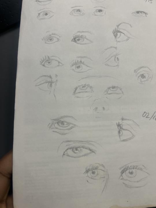
Old sketches from years back
These are what i call the “Lost Files” , as mostly a self learner inhad no idea what i should be practicing or for how long, before moving forward..90% from memory… its so cool to always look back
0 likes • 1d
@Jose Vanderpool This is so fun to see, and something I like to do every now and then as well. Pulling out some old artwork, especially from a time when you were just doing whatever because you didn't have a direction is a nice reminder of how far you've come as an artist. I hope getting this old stuff out was an encouragement to see how far you have grown! Thanks for sharing it with all of us!
1-10 of 404
Active 8m ago
Joined Aug 17, 2025
Powered by