Activity
Mon
Wed
Fri
Sun
Aug
Sep
Oct
Nov
Dec
Jan
Feb
Mar
Apr
May
Jun
What is this?
Less
More
Memberships
Divine Success Flow AI
264 members • Free
AI Accelerator
19.6k members • Free
AI Automation Circle
11.9k members • Free
AI Workshop Lite
27.7k members • Free
AI Academy
2.8k members • $9/month
AI Money Lab
84.4k members • Free
AgentX Academy
653 members • $37/month
AI Automation Society
416.8k members • Free
AI Automation Agency Hub
327.6k members • Free
8 contributions to AI Automation Society


0 likes • Nov '25
@Justin Lord Exactly! AI handles the grind. Humans handle the genius. Best combo for real business growth.
0 likes • Nov '25
@Noel Doe Absolutely, thanks for resonating with it
1 like • Nov '25
Absolutely @Kevin troy Lumandas
0 likes • Nov '25
@Noel Doe Couldn’t agree more

🔥
Nov '25 •
Avoid Trap
“Why Most AI Agencies Fail (And How You Can Avoid That Trap)” Let’s call it out — AI agencies are popping up daily, but 90% are dying just as fast. Why? Because they’re doing this: Selling “chatbots” instead of solutions. Using free tools with no system behind them. Automating random things clients don’t even care about. Here’s what actually works 👇 ✅ Start with pain. Ask, “What’s the one process your client hates doing manually?” ✅ Build around outcomes. “Save time” is weak. “Save 8 hours per week + 2k per month” sells. ✅ Keep the stack simple. Use 3–4 tools max. More tools = more chaos. ✅ Sell the system, not the setup. People don’t want AI. They want results that AI gives. Stop chasing trends. Build workflows that actually make someone’s life easier — that’s the difference between a hobbyist and a real operator.
3 likes • Nov '25
Very well said @Muskan Ahlawat

Nov '25 •
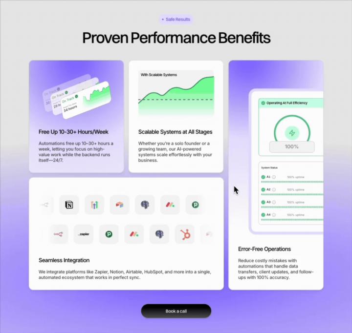
Add this to your agency's page and watch conversions climb 📈
Most agency pages list benefits as boring bullet points or generic claims like "save time" and "grow faster." That doesn't move buyers. Here's a bento box section I built for an AI agency landing page. It shows specific benefits in a scannable grid, not a wall of text. Why this works: 1. Visual hierarchy: Each benefit gets its own card with an icon/visual, so visitors read fast 2. Specificity: "Free up 10–30+ hours/week" beats "save time" 3. Placement: put this right above your first CTA to remove doubt at the decision point 4. Credibility signals: Integration logos (Zapier, HubSpot, Notion) show you're legit without saying "we're legit" Do the same for your agency page and you'll stand out from 90% of your competitors. Comment AUDIT + your URL — I’ll send a 60–90s Loom with 2 specificity fixes and 1 layout tweak for your benefits section. Doing 10.
2 likes • Nov '25
Good one
Oct '25 •
What will you automate first?
If you could automate one part of your daily workflow with AI today, what would it be and why?
Poll
22 members have voted
1 like • Nov '25
@Roger Roland Let’s goooo 😀
2 likes • Nov '25
@Frank van Bokhorst Couldn’t agree more, human in the loop can’t be ignored.
1-8 of 8

@adeel-asghar-9891
Helping businesses save time & money using AI
Active 15d ago
Joined Jun 4, 2025
Berlin, Germany
Powered by