
🔥
5d • Questions ❓
Did I do better this time?
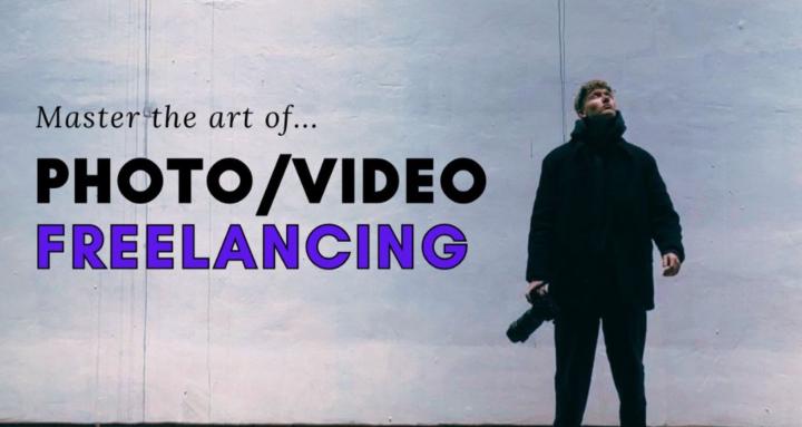
Thanks for all your suggestions, I made the purple less intense and a bit easier to see the images as well as more consistent.
1st image is what it looks like now, 2nd is what it looked like before, 3rd is the first ever iteration with the colors.
Images are not entirely final, I want to change the one for "offer" eventually as well as "scaling" or "personal brand" perhaps. Let me know honestly what you think, yay or nah?
YAY
NAY
In between (comment improvements)
12
35 comments
Did I do better this time?
powered by
skool.com/photography-skool-8350
Learn to grow your photography/videography business! 💸
We are all in this together to have fun and learn! 🤝
See you inside the community 😜👋
Suggested communities
Powered by