Activity
Mon
Wed
Fri
Sun
Jul
Aug
Sep
Oct
Nov
Dec
Jan
Feb
Mar
Apr
May
What is this?
Less
More
Memberships
Global Early Careers
443 members • Free
AI Automation Society
385.9k members • Free
30 contributions to Global Early Careers

Dec '25 •
Module 5 : A/B Testing & Experimentation
Basically, A/B testing stops you from guessing. Instead of just saying "I think this new feature will work," you prove it. 1. Group A (Control): Uses the app as normal. 2. Group B (Test): Gets the new "Cashback" feature. If Group B stays longer than Group A, you win. My biggest realization: You need that Control Group (Group A). If you give the bonus to everyone at once and sales go up, you won't know if it was because of the bonus or just because it was payday. Group A proves it wasn't luck. Don't guess. Test.
0 likes • Dec '25
@Dawood Suleman Thanks
Dec '25 •
Module 6: Payments & Digital Transactions.
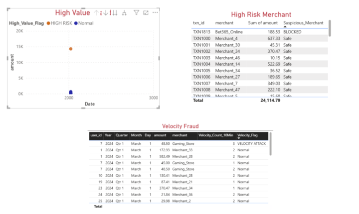
This module wasn't just about data; it was about the infrastructure of FinTech. I learned how money actually moves (The Issuer vs. Acquirer vs. Network). My Assignment: I built a Power BI dashboard to automatically catch 3 types of fraud in a dataset: 1. Bots: I wrote code to spot users swiping their cards 3 times in 1 minute (Velocity Fraud). 2. Whales: I flagged a user spending 14,000 AED when they usually spend 50. 3. Risky Business: I blocked transactions at gambling sites like "Bet365." Big Lesson: Fraud detection is basically just defining what "Normal" looks like, and writing a formula to scream when that pattern breaks.
Dec '25 •
Modules 3 & 4
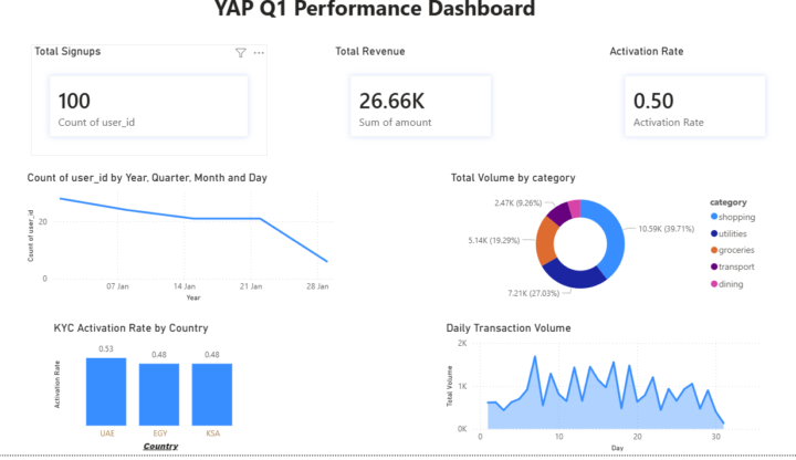
I used to think a dashboard was just about making data look pretty. After finishing the Analytics & Visualisation modules for the YAP simulation, I realised a dashboard is actually an argument. I have designed a 4-quadrant dashboard to answer "What, Where, and Why." - Top Left (Growth): Line Chart – Shows the sharp decline in signups in late January. - Top Right (Behaviour): Donut Chart – Proved "Shopping" (52%) is the dominant category, positioning YAP as a "Lifestyle Card" rather than a utility bill payer. - Bottom Left (Ops): Bar Chart – Highlighted that UAE (53%) converts users significantly better than KSA & Egypt (<49%), identifying a regional technical issue. - Bottom Right (Volatility): Area Chart – Showed daily volume spikes, indicating inconsistent user habits. Disclaimer: This is not the actual data.


1 like • Dec '25
keep going!
Dec '25 •
YAP Data Analytics Internship : Module 2 | Data Management & Cleaning (SQL)
Things I Learned Cleaning Data(dummy) Data Analysis isn't just making pretty charts. It’s 80% Janitor work. I thought Data Analytics was mostly about visualizing trends and finding the magic insight. The Reality? You can't find the magic if the data is noisy. What I learned about Noise: Real-world data is messy. It has duplicates, missing timestamps, and status codes that don't make sense. - If you just run SELECT *, you get a table. - But if you don't filter for Data Quality first, you get wrong answers. I learned that a NULL value isn't just an empty cell, it's a potential broken business process. A duplicate ID isn't just a typo it's a system glitch. Excited to have added SQL Data Cleaning to my toolkit. It’s the unglamorous skill that makes the glamorous insights possible.
1-10 of 30

@dhaval-kakadiya-2194
Aspiring Data Analyst | FinTech Enthusiast | Intern at YAP
Active 7d ago
Joined May 23, 2026
Powered by