Activity
Mon
Wed
Fri
Sun
Nov
Dec
Jan
Feb
Mar
Apr
May
Jun
Jul
Aug
Sep
What is this?
Less
More
Owned by Paris
It's not how much money you make, it's how much you keep. Turn your income into wealth, and build a massive bank account.
Medical Courier Community
34.2k
Free
Digital Growth Community
61.9k
Free
Multifamily Wealth Skool
21.1k
Free
The AI Advantage
129.7k
Free
Skoolers
153.6k
Free
Speaker Mastery Community
194
Free
Millionaire Momentum Life
320
5.0
Free
484 contributions to Speaker Mastery Community

Aug 6 •
I'll be speaking live August 14th
It's free REGISTER HERE — https://mycollabpilot.com/r/jj575md9

May 1 •
WINS!!!
Congrats @Emillio Rodriguez for becoming one of our speakers! We're going to be booking him on podcasts next week! Congrats to @Bart Merrell for landing a 45 minute keynote at the Toastmasters conference next week! Congrats to @Paris Cluff for landing new clients with his ads! Tell me your wins this week:
2 likes • May 1
I was invited to present to an Christian Entrepreneur group and 58 people showed up.. it was on Zoom and I did a ton of interactive things... I have 5 appointments so far from doing that, hope more come in!
1 like • May 1
@Jeremy Lopez Thank you!
Apr 3 •
Feedback please
On today's call we shared our one sheets and mine was up for review... This is a comparison with the old and the new.... Please help me make it better.
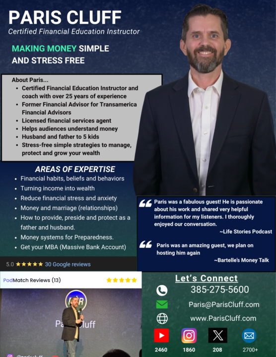
1 like • Apr 6
@Willie Blake great idea, bro. Thanks. I'll with on that today
0 likes • Apr 7
@Willie Blake @Marianne Hickman How about this?

Apr 2 •
Speaker 1 sheet share
As per @Marianne Hickman request at today's meeting, here is my 1 sheet which I filled out using Marianne's templates shared with us
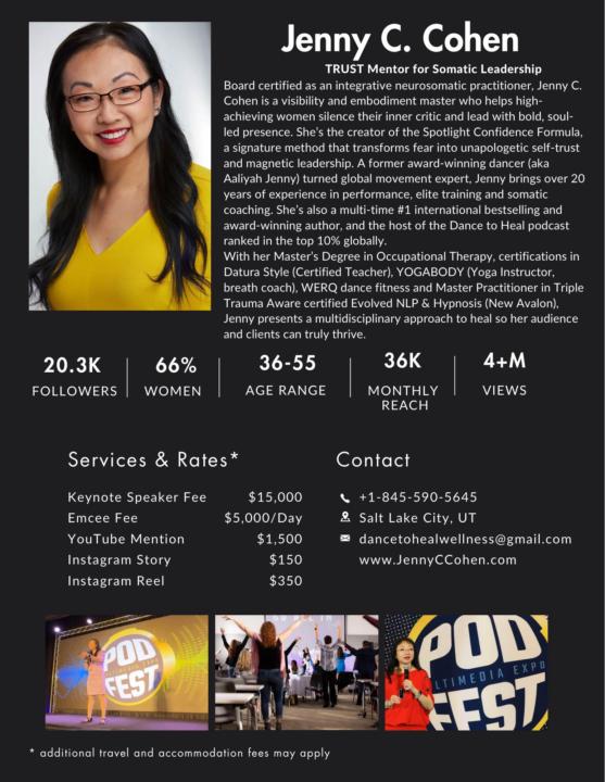
4 likes • Apr 3
@Jenny C. Cohen I love your photo, the smile is very inviting. Everything looks great! One thing that stood out was the paragraphs about you look too squished together. Starting at "With her Master's Degree..." I feel like that needs some space between it and the paragraph above it. Breaking those up into easier to read paragraphs. Great job!

Apr 2 •
One Sheet Review
It was great to be on the call today! Its been a while since Ive updated it. Love your suggestions with it as i make changes! Heres my One Sheet:
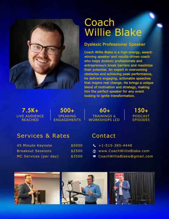
2 likes • Apr 3
@Willie Blake love your design bro... just a quick thought. The yellow font of the paragraph about you strained my eyeballs a bit... I wonder if you make that paragraph white, or a different color it will stand out a bit and make it easier to read and it doesn't all just get lost in the color. Again, a 1-2% thing that may help make a difference. I like the spotlight effect, that is cool!
1-10 of 484

@paris-cluff-8194
My program helps you turn income into wealth, become debt free & financially independent. It's time to get your MBA. (Massive Bank Account)
Active 19h ago
Joined Mar 5, 2024
Spanish Fork, UT
Powered by